Mastering Your Art
“Where the spirit does not work with the hand, there is no art.”
Leonardo Da Vinci
Post written by Katarina Miletic Follow me on Facebook
This is my latest painting, in steps it took to create it on paper. It is my very first art tutorial in this format and the only thought behind publishing it - is to connect with another soul on the same level.
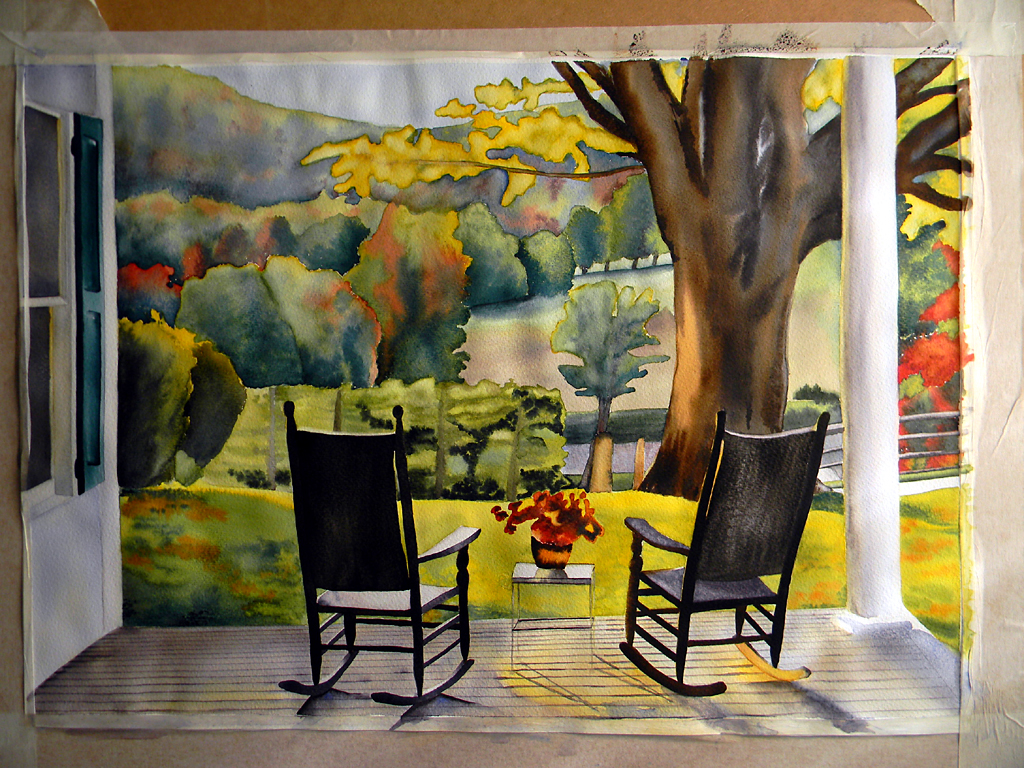
This aquarelle painting is called Angela's View. I took an inspirational photo that really corresponded with the vision I was to create for one of my best friends. I am not the author of the photograph on this occasion.
Angela's View - Steps

Find yourself a spot with plenty of natural light and make sure you spend time doing a precise drawing. The happier you are with the drawing - more likely you are to be satisfied with the look of your completed painting. Time spent on this really pays off in the long run.

The paper I used is Langton 'rough' by Daler-Rowney, A1 size. The colours and most of the brushes are Windsor & Newton (such as Cotman and Sable). Rest of the brushes are Chinese silk painting brushes (made of various natural hair, which have a wonderful shape and hold water and colour extremely well), Ron Ranson Hake and other Pro Arte brushes. Colours I used for this painting are: Ultramarine Blue, Indigo Blue, Lemon Yellow, Cadmium Yellow, Olive, Viridian and Sap Greens, Burnt Sienna, Burnt Umber, Caput Mortuum Violet, Ivory Black Cadmium Red, Alizarin Crimzon and Sepia.

The initial washes for sky and distant tree covered hills are laid down first. I worked wet on wet and added pure colour for some bright autumn reds. Also, a lot of ultramarine was used to create a feeling of distance in the painting. A very light wash was applied in the middle ground where harvested ground lay bare in the mist of the oblique light. (I just want this area to disappear in the distance and create illusion of space in my painting.)

Trees are added in the middle ground, with a little more definition, but no details. Autumn colours with a lot of blue in the washes. They had three layered washes to give them a little more depth, as they should appear nearer to the viewer than the distant hills.
Next I painted some bright yellow leaves on the big tree in the garden, using both yellows. I added more foliage to the right of the porch column. Also, shrubs in front of the house and the hedge marking the edge of the garden. I added some ivy in darker colour and I used subtle olive green for the hedge as a contrast to more vivid greens and reds of the foliage and brightly lit grass of the lawn.
Tree was given a first wash, wet on wet with a ultramarine/burnt umber wash, plus some darker colour was added for defining trunk and branches (sepia) and I decided to have exaggerate a spot where light hit the tree, making it very light and bright.
Grass was added last in this step, working fairly quickly across the whole area (in different sections). While the main wash was still wet I dropped in contrasting colour (green, orange, yellow) to represent fallen leaves.

Close up of the first wash on the tree trunk and the flowers on the porch table.

I painted flower pot on the table. Light wash was applied to the house wall and a little more vivid yellow for the decking. Then tree got a second wash with the same colours. At this stage I decided to preserve the bright spot on the tree for one of the main focal points in presentation of light.

Viridian & Indigo were the colours used for the shutters. Window was painted and a light ultramarine/burnt umber/alizarin crimson wash applied to the part of the deck shaded by the house. Next two photos show more details on the shutters, garden shrubs and the tree...


Lines of the decking wood were added and both chairs painted in. I worked from the lightest to the darkest areas, paying very close attention where light was hitting the wood of the chairs. They were painted with ultramarine/burnt umber washes of more strength. The right chair is brown in colour and the left one is black and the back on both of them were painted in ivory black wash to get the contrast and focus.
Shadows were added underneath the furniture using ultramarine blue and burnt umber, and paying attention not to cover the areas where light is hitting strongly. Column was painted in light yellow first, allowed to dry and another coat of ultramarine/burnt umber pained on top, darker on the left side, creating illusion of a round shape of the column.

Close up of those most important shadows and the chairs themselves. Definition added at the bottom of the porch column and details on the flowers on the table. Finer work on the bark of the big tree, picking out some more details and colours. And tidying up the little table, too.

Closer look... I am now ready to sign it...

Framed painting. It's ready to meet the recipient, my friend Angela. (You can see the finished, unframed painting at Galeria Katarina.)

Painting reaching Angela's wall, having pleased her tremendously. It's difficult to describe the feeling of joy at her reaction. It has found home, no doubt. And the spirit that has guided my hand has reached the heart of my friend.
That is my art.
Comments
Post a Comment